
DESIGNING WITH BOLD COLOR:
Everything You Need To Know
When thinking about 2023 design trends bold color is back! Infusing color into your home design is a great way to make a design statement, make the space feel personal to you, and create the mood you want people to feel.

Photographed by Kat Alves Photography
That being said things can go wrong if you don’t use color wisely. The look can go from ultra chic to tacky very easily. If you want to add more color to your home but aren’t sure how then keep reading because we’re covering all things related to bold color design.
How to decide on a bold color
You may already know what hues you’re drawn toward and have an idea of what color(s) you want to incorporate into your home. But if you don’t we have some tips to help you narrow down your options.

Photographed by Ellen Vanessa Photography
Get to Know What Colors You Like
Before you start looking at paint swatches, fabric samples or materials get out of the house and take note of things you’re drawn to. How do they make you feel? This could be out in nature or around town or at shops or restaurants. Look through design magazines or browse design publications online and save images you like.
Consider the feelings you want the space to evoke. Colors have an impact on our psychology and mood. Bright vibrant colors are typically more energizing, while cool softer tones are more relaxing and calming.
Photographed by Stephanie Russo
Find an Inspiration Source
A great way to develop a color palette for a room is to start with a source of inspiration. By taking inspiration from one design element that you love, you can then build your color scheme for the rest of the space from that one item.
This could be a pattern from a fabric, tile, wallpaper, or other material you like. Or from a decorative accent like a piece of artwork, a rug, or a piece of furniture you want to include in the space.
For example, if you're using a painting as your main inspiration you can pull colors from that painting to inform the design for the rest of the space. You don’t have to worry about finding exact matches, but similar tones and hues so that it coordinates and looks cohesive.
Photographed by Kat Alves Photography
Get Familiar With the Color Wheel
Knowing what colors to combine can be challenging. That’s why you’ll want to consult the color wheel and familiarize yourself with color theory.
According to the color theory, there are 4 basic color combinations – complementary, monochromatic, analogous, and triadic. We’re reviewing each below.
Complementary colors: These are two colors that are directly opposite each other on the color wheel. Red and green, purple and yellow, blue and orange are all examples of complementary colors. When used together they make a bold impression. It’s best to pick one as your main color while using the other as a secondary accent color.
Monochromatic colors: These are multiple shades and tones of a single base color. This is easier to apply if you’re worried about matching colors incorrectly and creates a sophisticated and balanced look.
Analogous colors: These are three or more colors that are directly next to each other on the color wheel. This is a very versatile color combination. The best way to implement it is to choose one main color and then use the others as accents.
Triadic colors: These are three evenly spaced colors on the wheel – purple, green, and orange for example. The effect is similar to complimentary colors but not as high-contrast. This is a great way to create an adventurous palette. You can vary the tones of each shade to create a more balanced look. Again it’s best to select one main color and use the others as accent colors.
Create a Color Scheme for Your Home
When going through the process of selecting colors, it’s important the color scheme throughout your home is cohesive.
This means selecting a complementary color scheme for one room and then a monochromatic scheme of a different color likely will not work. Just as you want to be mindful that the colors in a single room will all work together, you’ll want to use the same mindset for your home as a whole.


Test Before You Commit to Colors
When dealing with color it’s vital that you try things out before you commit to them. Instead of buying paint, materials, or furnishings right away, you’ll want to test colors in the space. There's a big difference between looking at a swatch in a store or a product online vs. living with it in your home. Environmental factors like lighting (both natural and artificial) and the time of day will impact how something looks in your home.
With paint, you’ll want to try a few samples on your wall before you buy your final paint color. If you have a primed wall ready to go you can paint the samples directly on your wall, if not use posterboard and tape it up on your wall. Keep it up for a full day so you can see how the color changes and how you feel about it.
Experimentation is an important part of finding the right color combination. Look at hues together while swapping colors and shades in and out until you land on the palette that you’re happy with.
ways to incorporate color in your home design
Now that we’ve discussed the ways you can go about selecting colors and the factors to keep in mind, you may be wondering how you should incorporate them throughout your home. That’s what we’re diving into next!


Photographed by Stephanie Russo
Start With a Neutral Foundation to Highlight Colorful Accents
If you’re new to pairing colors and don’t have an art or design background then the easiest method is to start with a neutral base (walls, flooring, counters) and add color to your accent pieces (furnishings, rugs, decor, window treatments). A neutral foundation allows your accent color or colors to pop.
Keep the 60-30-10 rule in mind. This frames your color palette as 3 main colors. 60% of the room should be your dominant color, 30% of the room is the secondary color and only 10% of the room is your accent color.
Also, don’t be afraid to expand your idea of what neutral is. Typical neutral colors are white, black, gray, and earth tones. However certain blues and greens can also act as neutrals like a navy or a muted olive green.
Go for a Punchy Accent
One way you can make a big impact is with a single vibrant accent color. Think about doing an accent wall, painted ceiling, cabinets, or vanity in a stunning feature color, while the rest of the design remains more neutral.
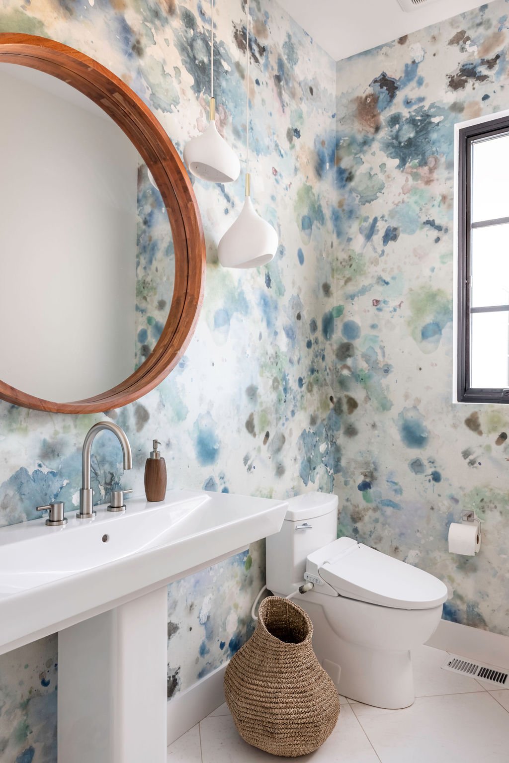
For example in the primary bathroom of our Open and Airy project, we went with a hand-painted blue ombre wallpaper on two walls. The subtle gradient softens the striking ocean blue color while still making a stunning focal point for the space.
Stick To Solid Colors
Solid colors can be easier to manage than a lot of patterns. Keep this in mind if you’re worried about the space looking too chaotic. It’ll help your environment look sophisticated and clean.
However, if you want to include prints, consider selecting prints with a monochromatic or limited color scheme. That way the color combinations look selective and intentional rather than arbitrary. A subtly patterned accent or wallpaper can act like a solid.
Make an Impact With Soft or Dark Colors
When considering bold hues you might be thinking about bright and vibrant colors, but that’s not always the case. You can make just as strong of an impression by incorporating soft tones or deep moody colors.
Think beyond saturated colors and explore the spectrum of varying shades and tones. It’s all about the feeling you want to create. Combining a bold color with something softer often helps create balance in your color scheme.

Photographed by Ellen Vanessa
Focus On Lower Traffic Rooms
If you’re new to experimenting with color another safe way to go about it is to try a lower-traffic room first. The effects of color can be magnified in a larger room, for that reason you may not want to start with a room that gets everyday use. Spaces like hallways, dining rooms, smaller bathrooms, and other types of pass-through rooms are a great way to try something fun and bold. It also acts as a nice unexpected surprise.

Photographed by Kat Alves
Don’t Forget to Edit
When it comes to color sometimes less is more. Remember to edit your design decisions. It’s easy to get caught up when inspiration strikes but it’s important to step back and consider your home as a whole. If you feel like a particular color selection may be too much, try and see how the space looks with it and then without it.
When in doubt call in professional help! At Kristen Elizabeth Design we’re experts at creating balanced color palettes and custom design schemes to fit your personality and lifestyle needs. We’ve taken on a range of projects some with bold color and others with more natural tastes, so we’re confident that we’ll create a beautiful design tailored to you exactly. From full-service interior design to design consultations, we offer a variety of services to meet a range of needs. Get in touch with us today to learn more!
Ready to get started? Contact us today to discuss your unique project goals and needs.