
Top Interior Design Rules to Follow (And When to Break Them)
Design Your Home Like a Pro
You want your home to not only look stunning but also seamlessly reflect your style and function with practical elegance. As you embark on an interior design journey, questions about the ideal drapery length, the perfect height for hanging artwork, and the optimal furniture spacing naturally arise.
Navigating the intricate web of these design details is like deciphering a blueprint, a roadmap for crafting spaces that are not only visually appealing but also tailor-made to suit your lifestyle. In this blog post, we delve into the world of interior design rules—when to follow them and when to break free—empowering you to approach home design with confidence. So, let's unravel the mysteries and embark on a journey to transform your interiors!

Kristen Elizabeth Design, Photographed by Kat Alves
How to Create a Color Scheme
The color palette is often a starting point for any design project. When planning the color scheme for a room see what colors you’re drawn towards—this could be from inspiration photos, artwork, or a prominent design element you have in mind for the space.
During this process, understanding the color wheel is important, which offers insights into the realms of analogous, monochromatic, and triadic color schemes. For those seeking contrast, consider complementary and split-complementary schemes.
The Design Rule:
At the core lies the art of utilizing neutral colors as a foundation, all within the framework of the 60-30-10 Rule for crafting a balanced and visually appealing space. We’re breaking this rule down below:
60% of the room as your main color: things like wall color, flooring, and large pieces of furniture.
30% of the space as your secondary color: think medium-size furnishings and accents.
10% of the room as your accent color: things like small accents and decor.
When to Break This Design Rule:
There are ways you can switch up this rule. For example, you can do 10% of two different coordinating accent colors or you can use this rule in a monochromatic color palette with three varying shades of the same color. Many designers use this same principle but with a 70-20-10 balance. More important than sticking to the rule is paying attention to the feel and how the colors balance the space.
Kristen Elizabeth Design, Photographed by Kat Alves (Left), Ellen Vanessa (Right)
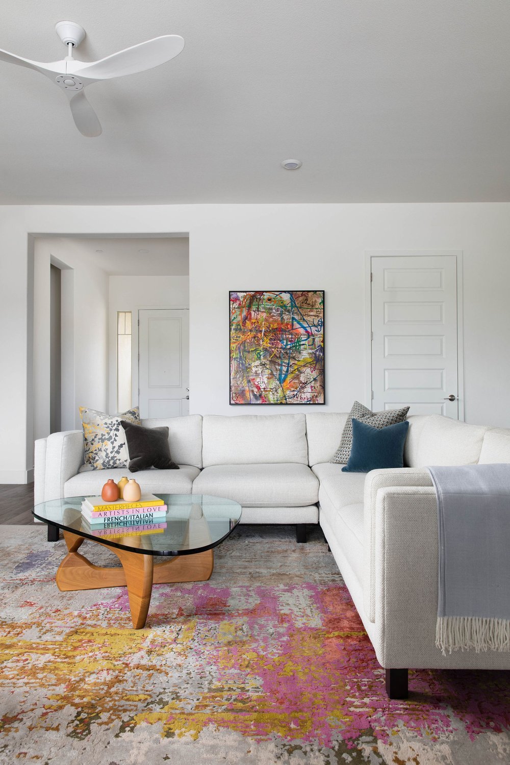
How to Hang Artwork
Hanging artwork is an important aspect of rounding out the design of a room—it can make the space feel beautiful, polished, and personal. But if done poorly it can ruin the room. In this next section, we’re diving into simple rules for hanging artwork like a professional.
The Design Rule:
The center of the artwork should be at eye level—60 inches from the floor. Here’s a step-by-step guide:
Mark the 60-inch point at the center point of your wall. This is where the center of your artwork will go.
Measure the total height of your frame and divide it by two to pinpoint the center.
Measure from the top of the frame to the top of your securely tightened picture hanging wire or hook. Deduct this measurement from the center frame measurement obtained in Step 2. This result indicates how far above the picture's center point your hook (or hanging mechanism) should be positioned.
Add the measurement from Step 3 to the 60 (your center height). This final sum represents the distance from the floor to where you should install your hook or nail, or your hang height. And remember measure twice and drill once!
When to Break This Rule:
This rule is great to use as a general guideline but it won’t work for all scenarios. Below are situations you’ll want to rethink this rule.
For a gallery wall: In this case, the center of your grouping of artwork should be around 60 inches with a few inches between each artwork.
Artwork over furniture: Aim to have 6-8 inches between the bottom of the frame and the furniture. They should be close enough that they visually appear as one unit in the space. The artwork should also be roughly ⅔ the length of the furniture.
For high ceilings: You’ll want to go a few inches above 60.
You’re layering and leaning artwork: You don’t have to hang artwork. You can lean it on a shelf, console, or dresser on its own or with a grouping of pieces in varying sizes.
If the 60-center rule doesn’t feel right for your space, hold your artwork at different heights and stand back to get a feel for what looks best!


How to Hang Drapery
Choosing the right window covering length involves a careful dance between functionality and aesthetics. It may seem straightforward but there are several factors you’ll need to consider including the size of the windows, the height of your ceilings, and what kind of hanging style and hardware you want. You’ll also want to think about whether a standard size will work or if you’ll need a custom length.
The Design Rule:
Rule of 10s: Aim to hang curtains 10 inches above the window trim and 10 inches wider than the window on each side. They also could be floor length, skim the floor, hang ½ an inch above the floor, or pool on the floor.
When to Break This Rule:
Again this general rule doesn’t work for every home. For higher ceilings curtain rod placement should be a few inches below the crown molding or 12 to 24 inches above the window trim.
For lower ceilings, the curtain rod should be placed close to the ceiling to create the illusion of height.

Kristen Elizabeth Design, Photographed by Kat Alves
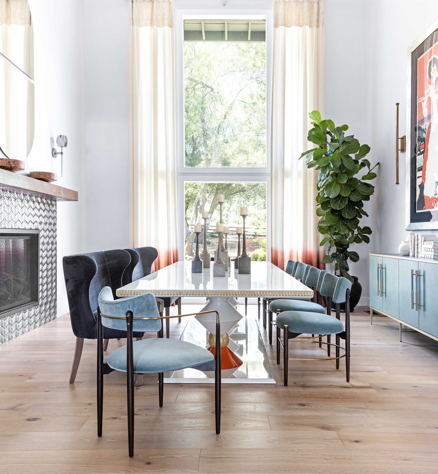
How to Arrange Furniture
Whether you’re arranging furniture in the bedroom, dining room, or living room, considerations for spacing and furniture scale impact room perception.
The Design Rules:
Again much will depend upon the size and scale of your home, but here are our furniture layout and spacing guidelines:
Leave 30 inches of walkway between large furniture pieces
Allow 14-18 inches between a coffee table and a sofa
Allow 4-10 inches of space between seating
When placing a sofa against the wall, leave 3-5 inches between the sofa and the wall
Area rugs should be large enough for the front legs of the sofa and all chairs at least
When pairing a sofa with accent chairs and coffee tables all the heights should be within 4 inches of each other
Nightstands should be 5 inches higher or lower than the top of your bed
For dining tables give 24 inches of space per person
When to Break the Rules:
These guidelines are very helpful to ensure you have good proportions and flow throughout your spaces. It may be challenging to stick to these measurements for smaller spaces. For example, 30 inches of walkway may not be possible, so in these cases leave a minimum of 18 inches. Also, play with smaller-scale furniture pieces so the room doesn’t feel too cramped.
How to Select Lighting
When designing your home lighting may be an afterthought, but it shouldn’t be. Proper lighting is a cornerstone of interior design, setting the mood and feel of a space while enhancing the overall aesthetic.
The Design Rules:
When planning your lighting scheme throughout your home, keep the following rules in mind.
Each room should have 2-3 lighting sources, don’t just rely on overhead lighting which can cast unwanted shadows and be unflattering. Use a combination of floor lamps, table lamps, pendants, and/or scones to create layered lighting effects and lighting control for each room. (Don’t forget dimmers allow for extra light control!)
Place your lighting sources strategically, and don’t forget task lighting.
Light bulbs should be hidden.
Pay attention to the light bulb tone and select a cohesive color temperature. We recommend warm white shades for an inviting atmosphere. (Color temperature—warm vs. cool—refers to the amount of whiteness in the light, which is measured in kelvins.)
When to Break These Rules:
While you don’t want to overdo overhead lighting, there are some cases where it’s ok to use overhead lighting like for a hallway or when you need to brighten the space for cleaning. Rooms that need brighter light like the kitchen and bathrooms also benefit from overhead lighting. Dimmers also help overhead lighting feel less bright and harsh.
Kristen Elizabeth Design, Photographer by Kat Alves (Left) & Ellen Vanessa (Right)
Call in the Pros
If you’re feeling overwhelmed by these rules and aren’t sure which ones to stick to (or break) then call in the design professionals! At Kristen Elizabeth Design, a full-service interior design firm serving the greater Sacramento area, we specialize in creating thoughtful, unique spaces that represent our clients.
We’ll worry about the details so that you don’t have to, creating beautiful yet functional interiors that you’ll love.
Ready to get started? Contact us today to discuss your unique project goals and needs.